Map of the United States color-coded by incidence rates per 100,000 people, with each state shaded in varying tones ranging from light to dark to indicate lower to higher rates. Numerical values are displayed on each state, showing specific incidence rates. A legend in the lower corner provides a color scale corresponding to the rate ranges. The map includes all 50 states, with Alaska and Hawaii shown inset at smaller scale on the left, and a title at the top referencing incidence cases per 100,000. Is Oregon a Hotbed for Melanoma?

Is Oregon a Hotbed for Melanoma?

Tuesday, June 15, 2021
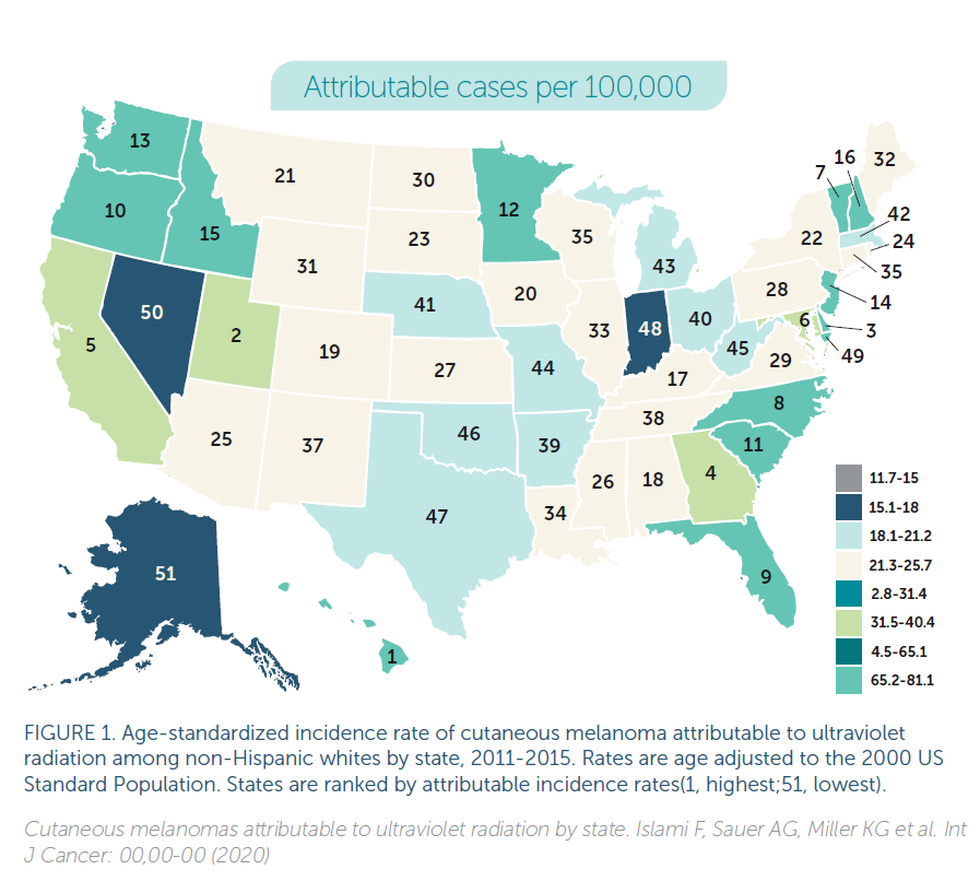
Over the last 50 years, the global rate of melanoma incidence has increased dramatically, on average between 3-5 percent per year. In the US alone, almost 100,000 new cases of…
Person outdoors in a green, tree-filled setting, wearing a bright green short-sleeve shirt and a white headband. One hand is raised to the side of the face, while the other holds a small white spherical object. A strap crosses the chest, suggesting a bag or backpack. The background is softly blurred with natural foliage under even daylight. It’s Don’t Fry Day!

It’s Don’t Fry Day!

Friday, May 28, 2021
The Friday of Memorial Day Weekend is “Don’t Fry Day”! PROTECT YOUR SKIN TODAY AND EVERY DAY There will be over five million new cases of skin cancer diagnosed in…